Shelley Jordon Website Redesign
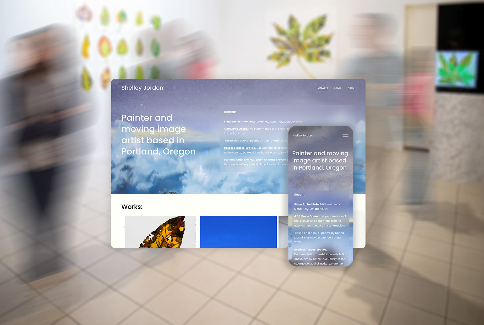
Website representing Shelley Jordon and displaying her works. Jump to solution->
- Role: Sole Designer
- Duration: 2 Months
- Completed: July 2025
- Discipline: Information Architecture, Brand Design, Content Management Systems
First Design
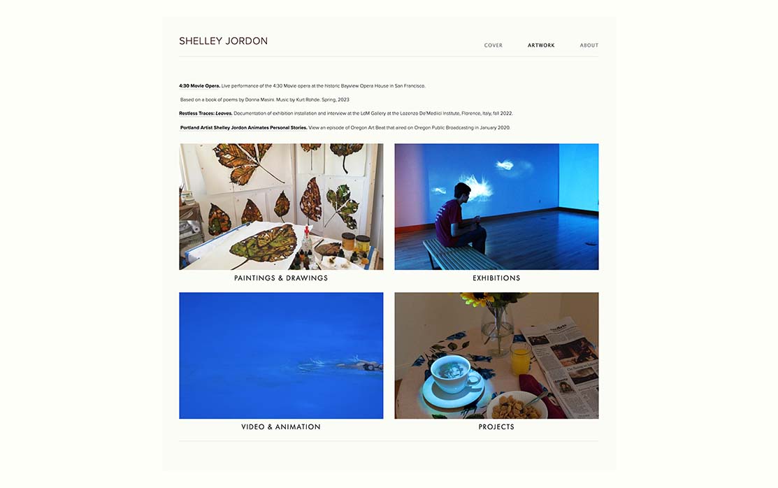
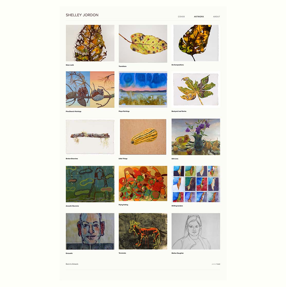
In 2020, I designed a website for artist Shelley Jordon with the goal of establishing a clear, accessible, and professional online presence. The site needed to showcase her portfolio with an emphasis on intuitive navigation for galleries and general audiences while also maintaining alignment with Shelley Jordon’s artistic voice and brand identity. To achieve this balance, I built the site on Squarespace, a platform that allowed for a simple yet effective design and an interface the artist could learn to manage herself.
- Goal: Organize and display works
- Approach: Content forward, effective galleries
- Aesthetic: Simple, understated
- Potential drawbacks: Lack of interest, not engaging
- Solution: Bold hook in the form of a "cover," encapsulating what the artist does

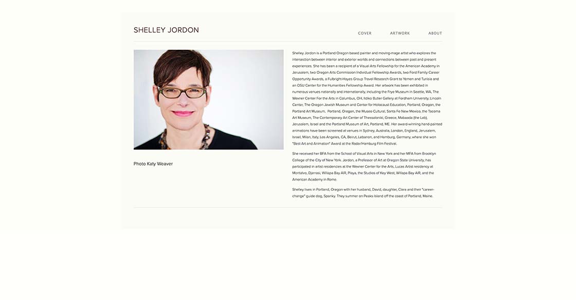
Pain Points
After five years of use, Shelley and I found the following issues and I set out to address them in the redesign:
- High bounce rate - Analyzing the site’s SEO, 46.34% of visitors would leave the site before navigating to another page
- Ambiguous naming - Category/page names are broad and can lead to confusion
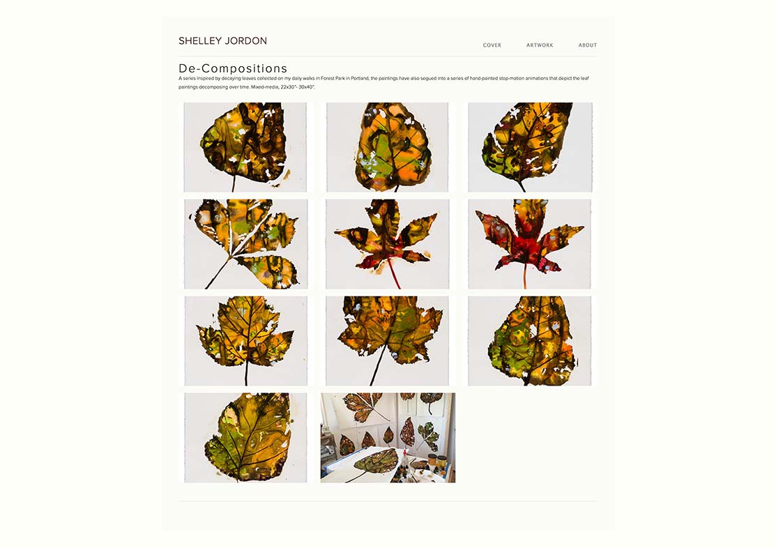
- Overwhelming information - Large amounts of information per page that could be broken up
- Outdated content - New works and exhibitions need to be included and old works relocated
- Difficulty updating site - Squarespace still intimidating and unintuitive for the artist
Redesign Process
Minimize Bounce Rate
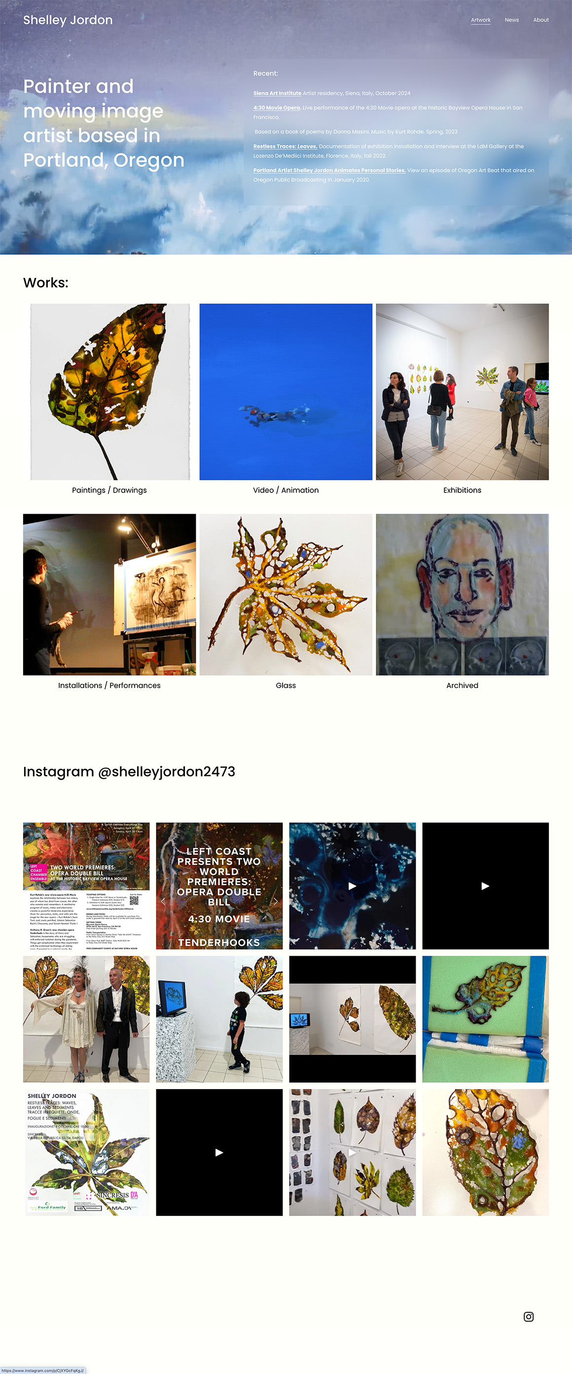
I linked the high bounce rate to the cover page. Although there was a clear path to the rest of the site, the unfamiliar format or the extra step appeared to discourage her audience's engagement.
To preserve the visual impact of the cover, I integrated the video directly into the hero section of the main page, ensuring her works were immediately accessible while maintaining a strong first impression. I presented three alternative layouts to Shelley, involving her in the decision-making process to ensure the redesign remained true to her brand identity.


Ease Site Updates
Certain features of Squarespace’s interface were more intuitive for Shelley than others. She responded better to visual drag-and-drop tools than menus, which made managing content easier for her. She independently began using the area above her artwork section to post her most relevant and immediate news.
As web designers, it’s essential to meet users where they are and design pathways that feel natural for them. I supported her approach by creating a dedicated dashboard for easily adding recent news. Since she relied on Instagram for most audience updates, I also integrated her feed into the home page, providing a seamless connection between her social media presence and the website.
I created reusable templates within Squarespace by saving sections in the interface, allowing Shelley to maintain consistency while easily updating content. Design extends beyond the visual presentation on the page; leveraging platform features to create reusable components supports both usability for the artist and the integrity of the design system. Applying principles of design systems and scalability ensures a cohesive, maintainable website, even on a no-code platform like Squarespace.
Counter outdated content,
Overwhelming information,
Ambiguous naming
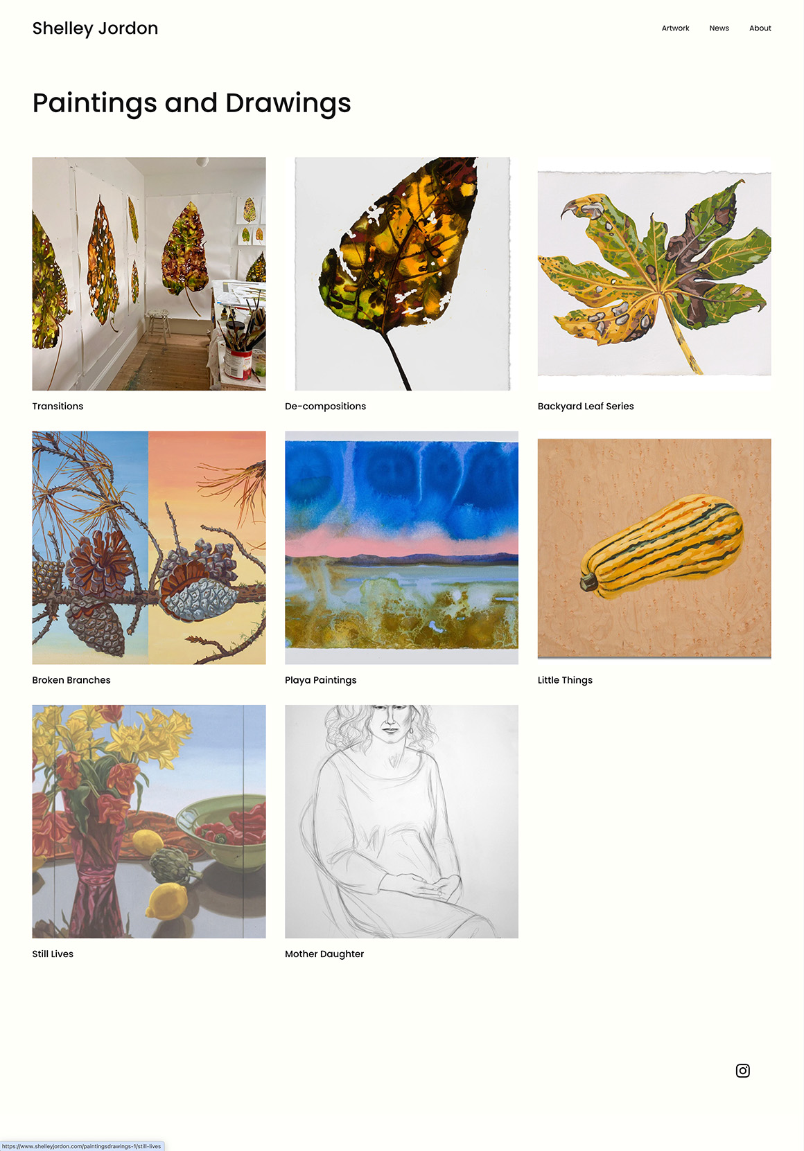
I overhauled the site structure to enhance information architecture and overall usability. Pages that were overloaded with content were redistributed, new works were incorporated, and older works were moved to a dedicated “Archived” section. New categories, such as “Glass,” were created for outliers, and ambiguous labels—for example, "projects"—were refined for clarity, brevity, and user-centered language.
Solution
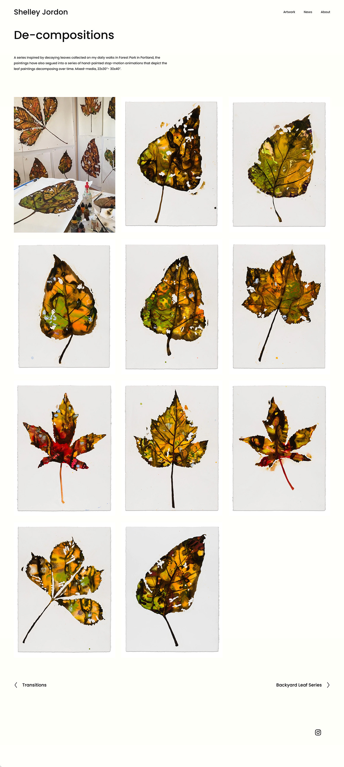
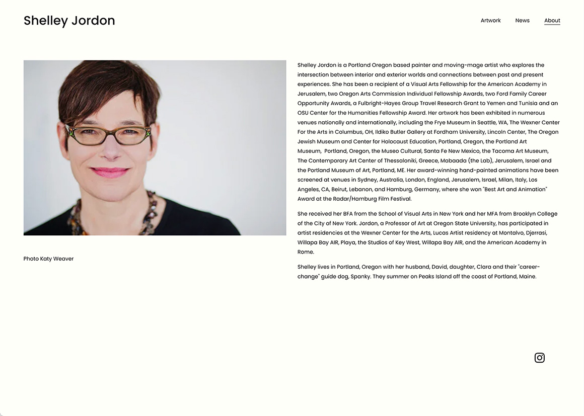
In updating the site from Squarespace’s older model to the new version, I aimed to stay as true to Shelley's brand as possible while simplifying and modernizing the typographic system. I simplified the fonts from Futura, Proxima-Nova, and Lucida Sans Unicode to one of their new font options, opting for Poppins for its clarity and versatility. I introduced a slightly more exaggerated typographic hierarchy to improve readability and guide the viewer’s attention.
Takeaways
The redesign successfully enhanced the visibility, usability, and overall presentation of Shelley Jordon’s work while remaining true to her brand identity. By refining the information architecture, integrating intuitive features for content updates, and creating reusable components within Squarespace, the site now offers both the artist and her audience a seamless, engaging experience. This project reinforced that web design and development extends beyond page layout, even when working with no-code solutions. Squarespace should consider leaning further into design system thinking and leveraging its "save section" feature for a component based system. Overall, the site now effectively showcases her body of work, maintains her distinctive voice, and provides a foundation that can evolve with her practice.