Venice Classic Car Restoration
Series of posters and brand assets for fictional automotive restoration company Venice Classic Car Restoration and its industry conference. Works explore different visual expressions of Venice, classic european cars, craftsmanship and nostalgia.
- Role: Sole Designer
- Duration: 1 Month
- Completed: June 2024
- Discipline: Illustrator, brand identity, visual storytelling
This project reimagines heritage-inspired visual identity systems through the lens of classic automotive restoration and mid-century design culture. It pairs vintage print aesthetics — halftone textures, offset silhouettes, and stencil typography — with contemporary composition and layout. The work draws connections between car culture, architectural craftsmanship, and local business branding traditions, positioning them as rich material for modern visual storytelling. Through posters, logos, event collateral, and typographic compositions, the project explores how nostalgia and analog processes can ground contemporary brand identities in authenticity and material history.
Works
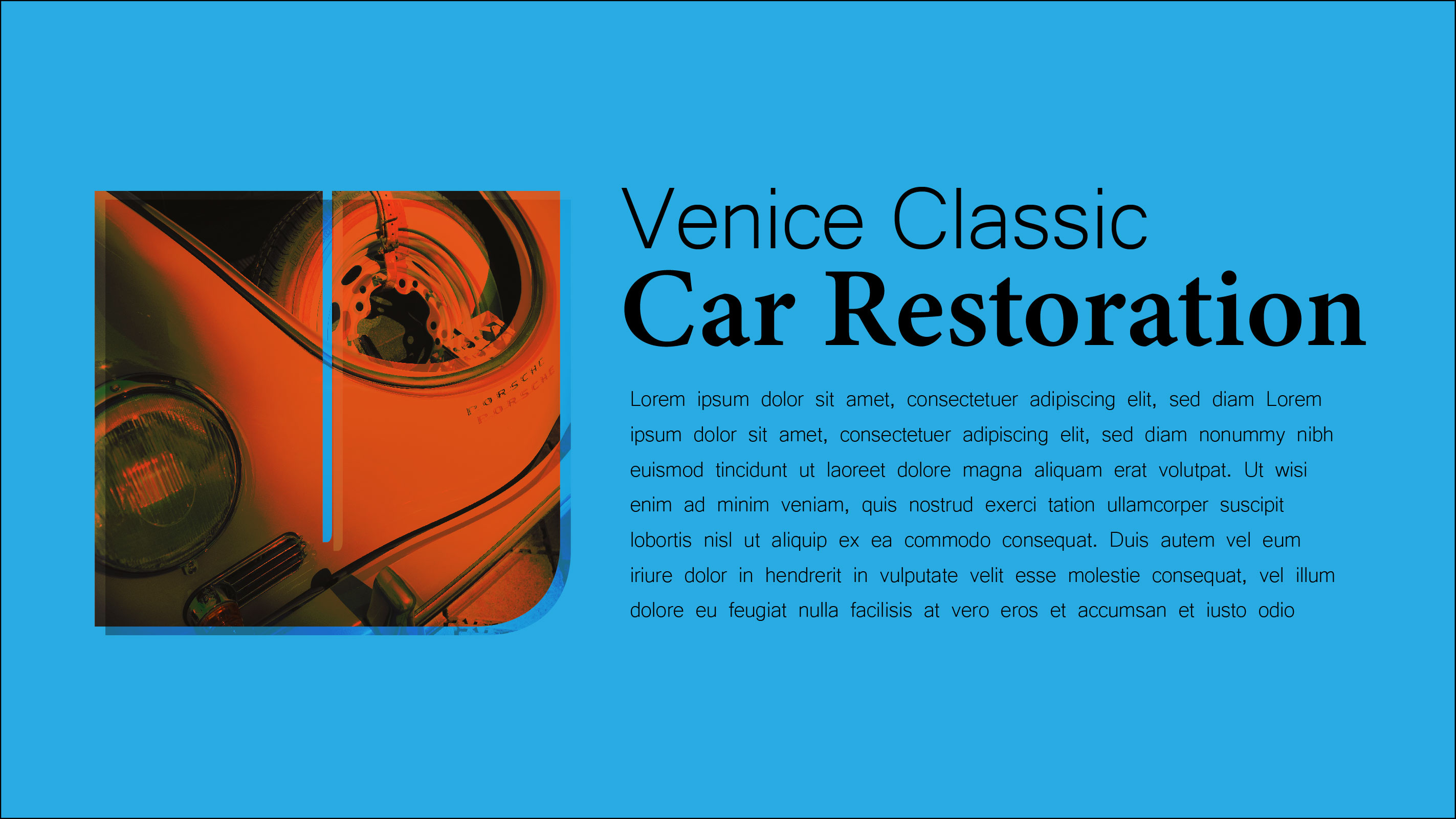
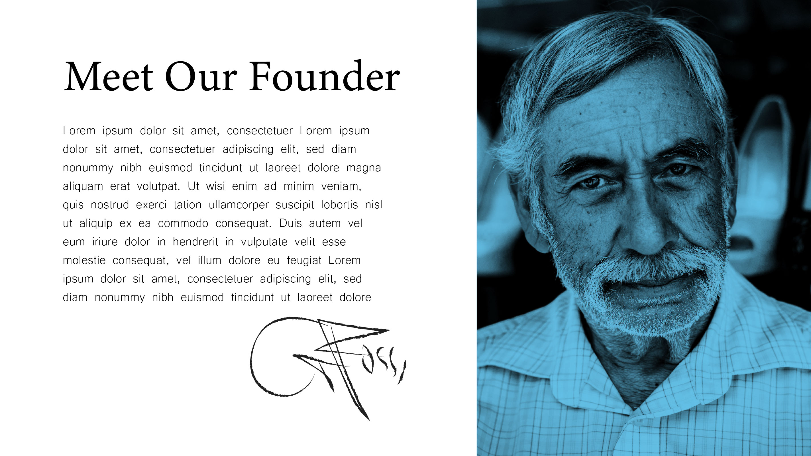
These two works explore identity through structural typography, complementary type systems, and brand storytelling. The first features the brand title alongside a descriptive tagline and a classic Porsche, framed within a bold, blocky silhouette of the letter V. It investigates complementary typeface pairings and color relationships to create a cohesive, contemporary brand presence. The second piece uses a similar typographic system, complemented by the personal signature and an intimate portrait of the business owner, reinforcing themes of craftsmanship, authenticity, and personal connection. Together, the works position the brand as a small, character-driven business rooted in care, heritage, and distinctive visual identity.
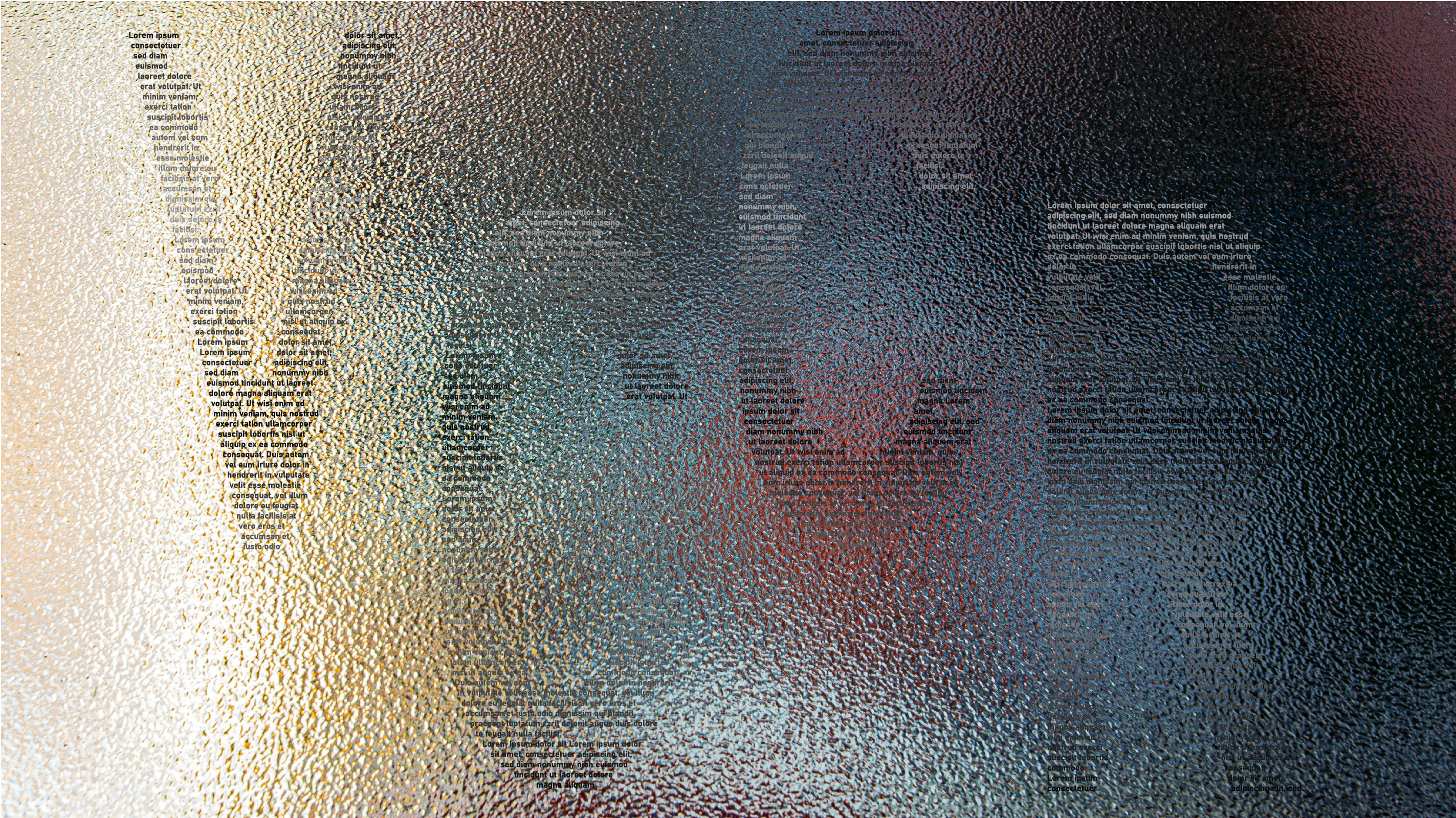
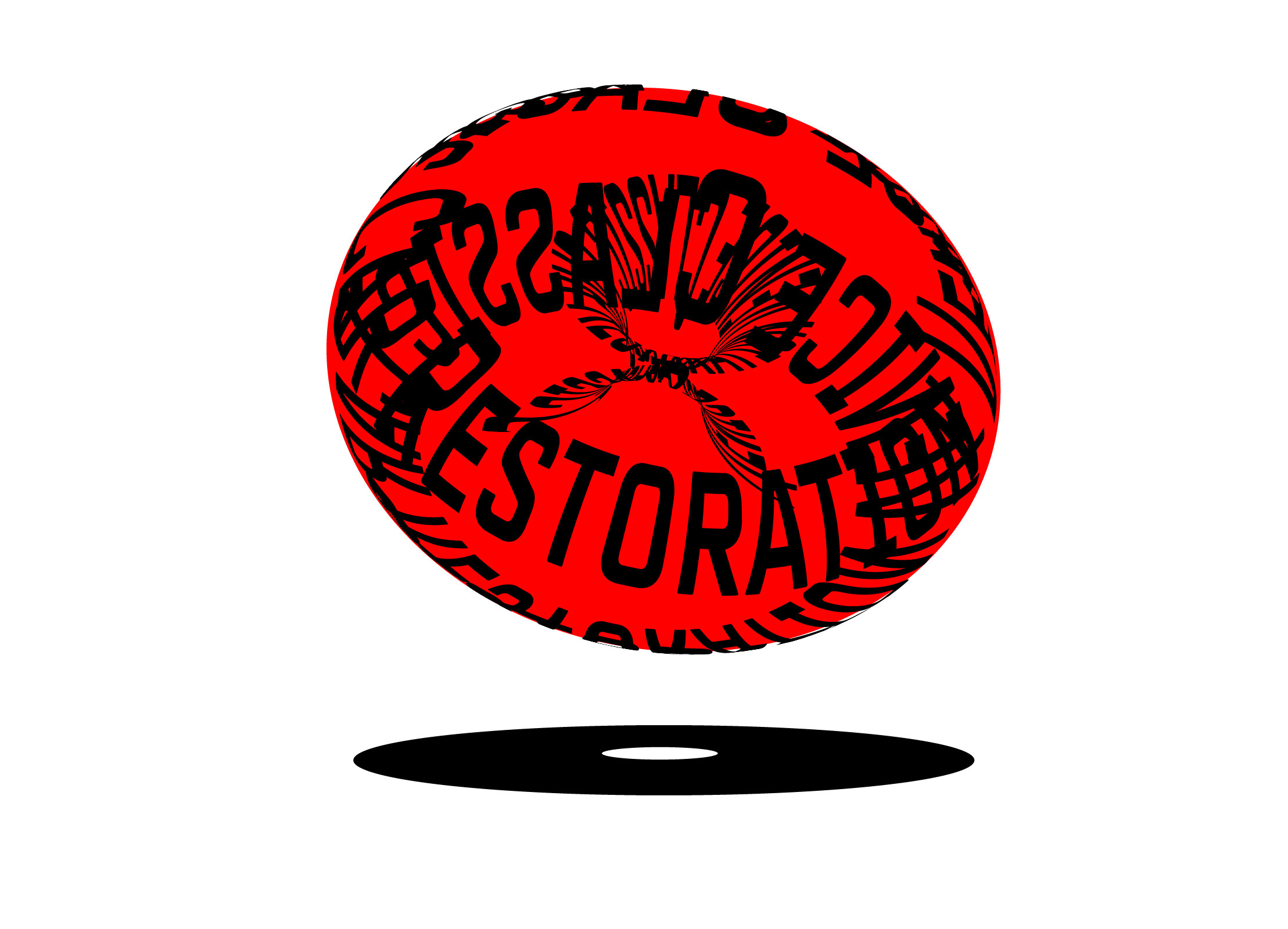
This typographic illustration explores the tension between legibility and form, using dense blocks of small, impractical type to construct the acronym V.C.C.R. The structure borrows from the tradition of concrete poetry, where the arrangement of words and letters takes on a visual presence equal to their meaning. The left-aligned text within each block creates an uneven edge, suggesting a subtle sense of speed, direction, and movement across the composition — as if the type itself is pushing forward through the space.
The background features a colorful, atmospheric scene obscured by stippled glass — a material loaded with nostalgic and cultural weight. This kind of textured glass recalls early 20th-century urban streetscapes: barbershops, diners, corner offices, and general stores. Before mass-produced plastic signage and digital displays, businesses announced themselves with hand-painted lettering on glass, a practice rooted in craftsmanship, local identity, and permanence. In visual culture, this texture signals authenticity and care, evoking a time when design was inseparable from material presence and physical context. Modern brands pursuing heritage-inspired aesthetics often echo this tactile quality, valuing surface, imperfection, and tradition as markers of credibility.
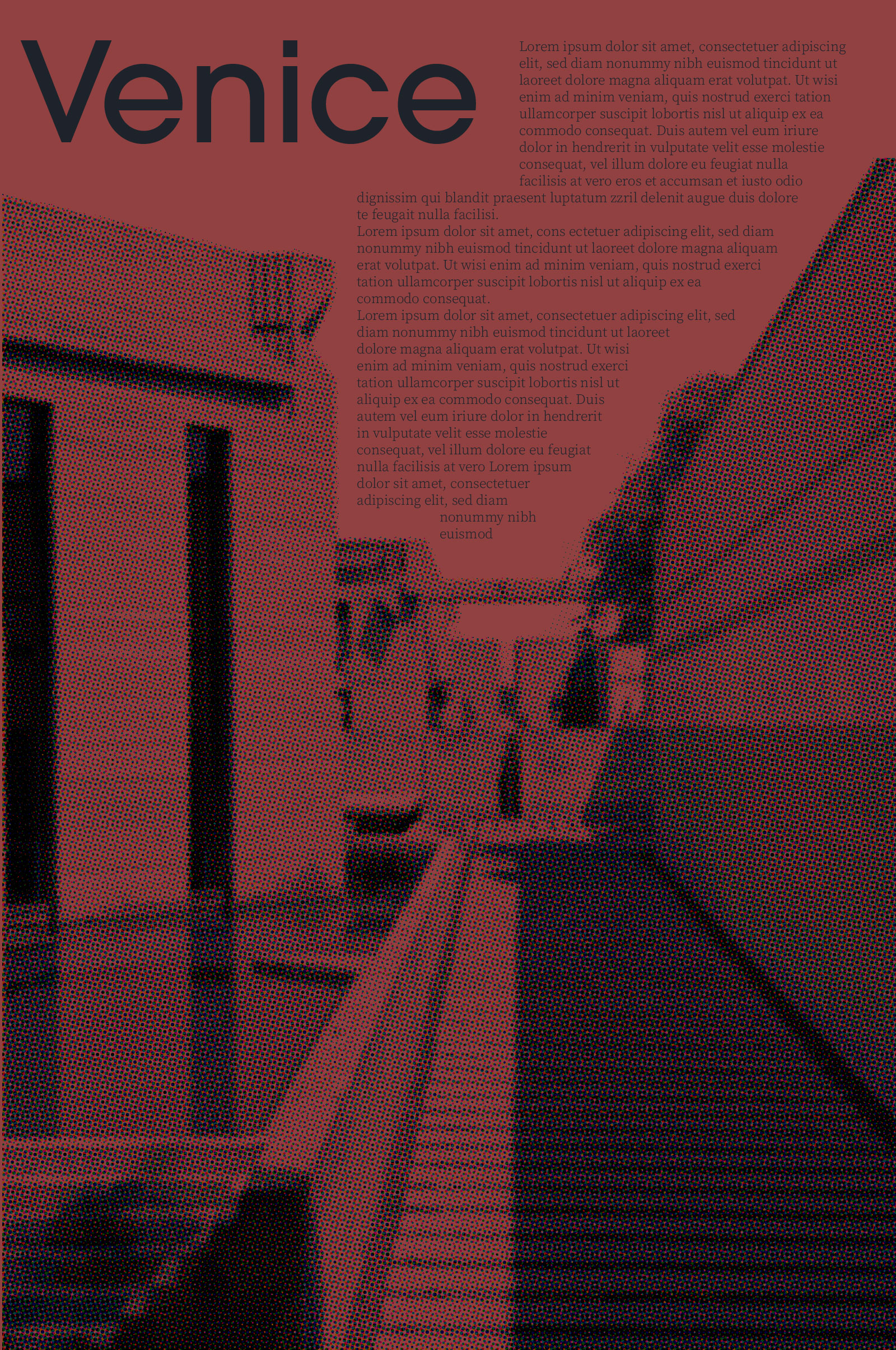
Another piece in this series centers an image of Carlo Scarpa’s Brion Tomb, drawing a connection to Venetian craftsmanship and architectural heritage. While it moves away from the automotive imagery of other works, it keeps Venice at the conceptual core through Scarpa’s enduring influence on design culture. The image is rendered in a halftone texture, referencing early analog printing techniques and evoking a tactile, archival quality. A carefully positioned text box follows the geometries of Scarpa’s architecture and the composition of the photograph itself, creating a visual dialogue between type, image, and structure. This interaction between historical craftsmanship, modern layout, and nostalgic print aesthetics situates the piece within a larger conversation about heritage, materiality, and the enduring cultural presence of Venice in craft and culture.
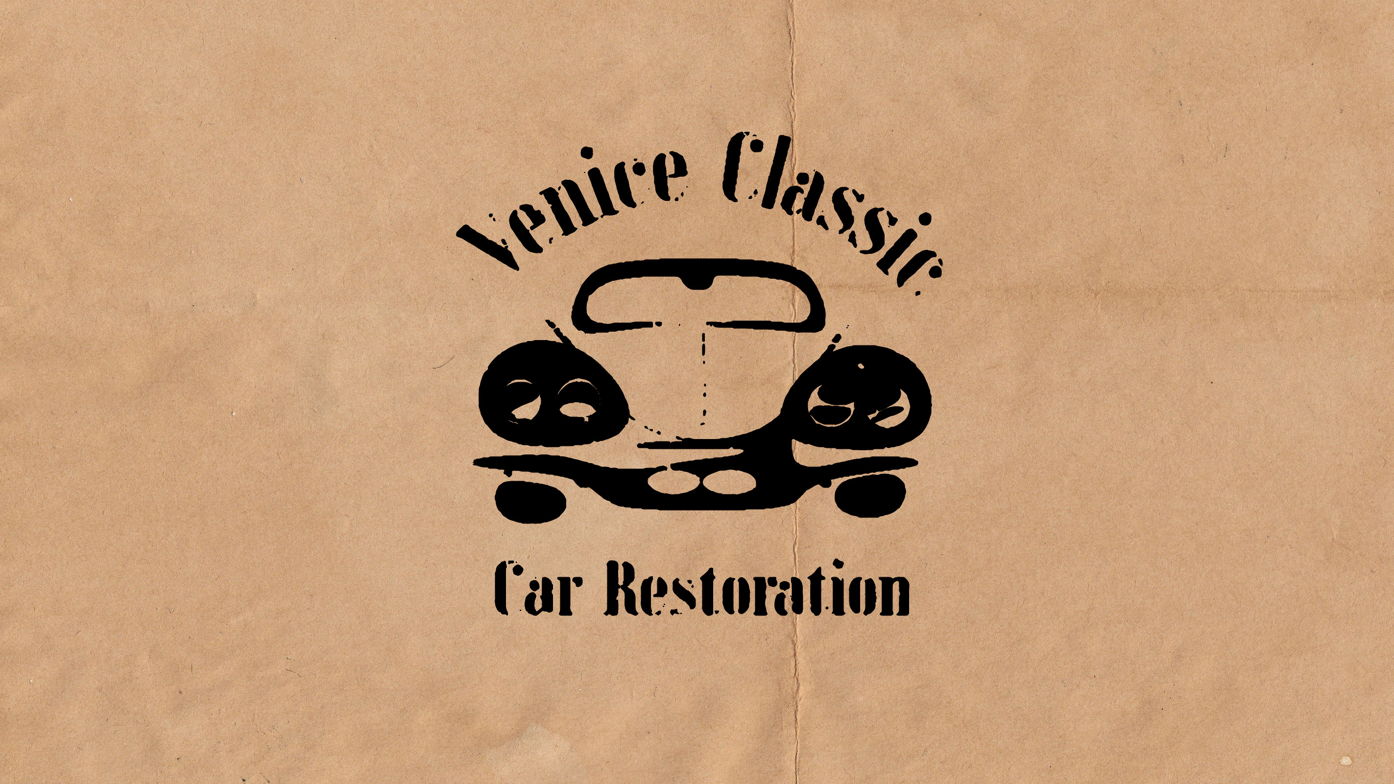
The logo concept features a friendly, classic stencil typeface, placing the text along a curved path as a deliberate nod to mid-century business signage and hand-painted storefronts. At its center is an abstracted illustration of a 1950s-era car — not a precise make or model, but an evocative form that captures the optimism and futurism of the postwar automotive boom. The shapes are rounded, simplified, and slightly exaggerated, nodding to modern art. To ground it in physicality, the textures are roughened and distressed, making the logo feel equally at home stamped onto a paper bag, printed on kraft stock, or painted onto glass — a tangible callback to the era’s humble, handcrafted commercial graphics.
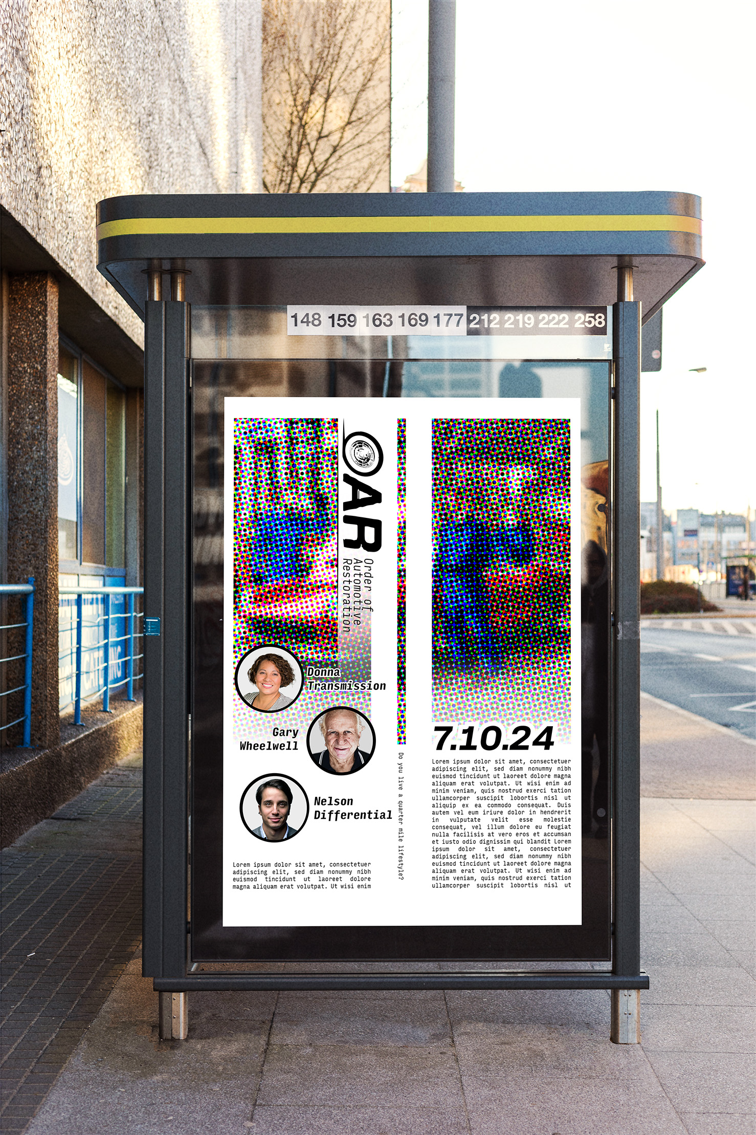
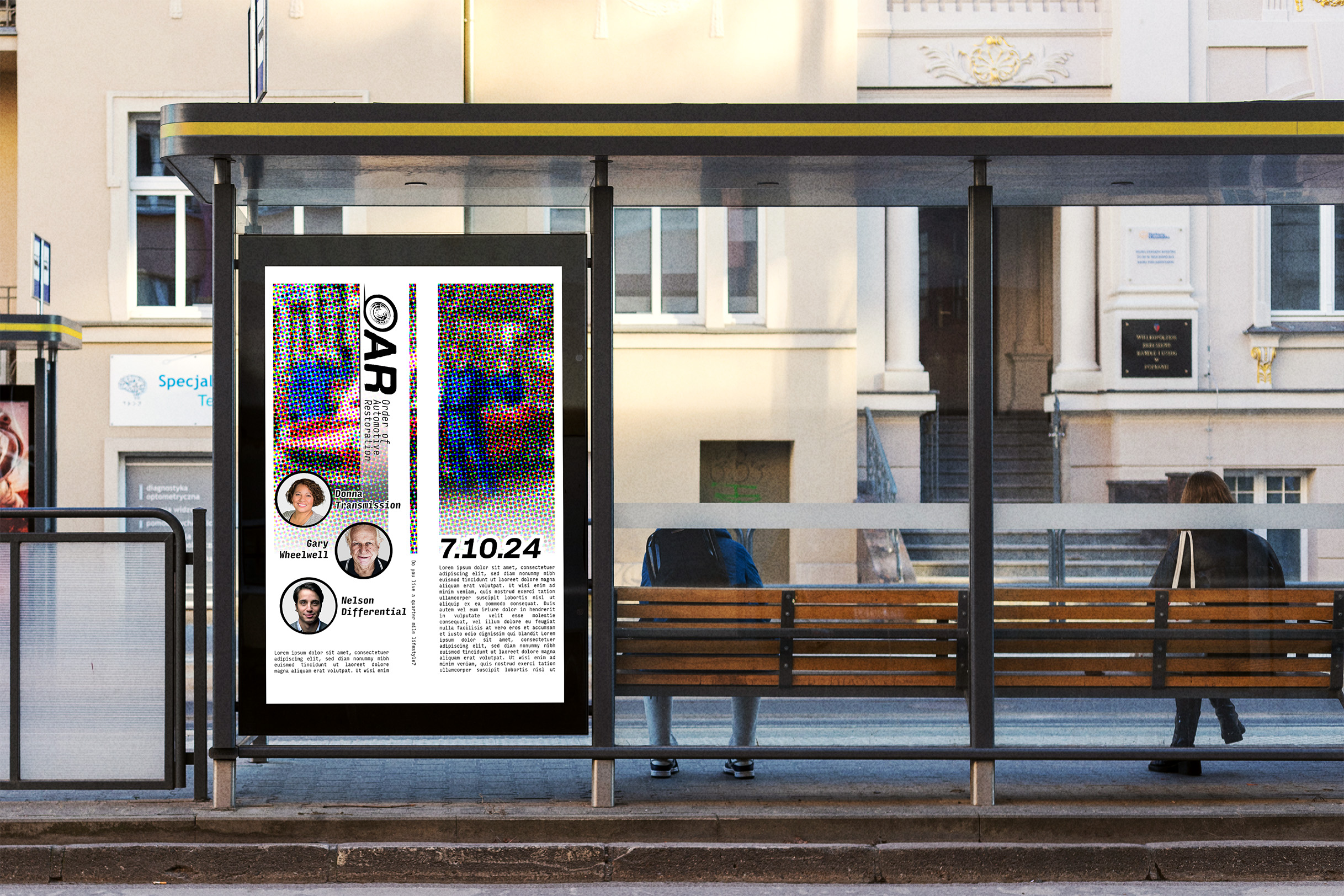
One of the final mockups is a poster design for the company’s annual industry conference, The Order of Automotive Restoration. The poster continues the visual language established across the brand, using halftone textures to evoke old-school printing processes. At its core is a custom, photoshopped scene depicting three mechanics in blue coveralls gathered around a classic red Ferrari inside a garage. The halftone obscures the scene just enough to create visual intrigue — from a distance, the viewer reads the bold blocks of poppy reds and deep blues, but as they approach, the halftone effect reveals itself, adding material texture and historical reference. The color palette highlights the mechanics and car, supporting immediate recognition of the conference’s focus. Other graphic elements include the event logo, which uses a typeface evocative of vintage racing culture, with the O in OAR rendered as a chromed whitewall tire. A subtle line trails off the tire, suggesting movement and speed, while white racing stripes and directional gradients throughout the composition amplify that kinetic energy. The layout prioritizes the logo, event date, and portraits of three featured speakers, reinforcing a sense of community and personal connection to the people shaping the restoration world.
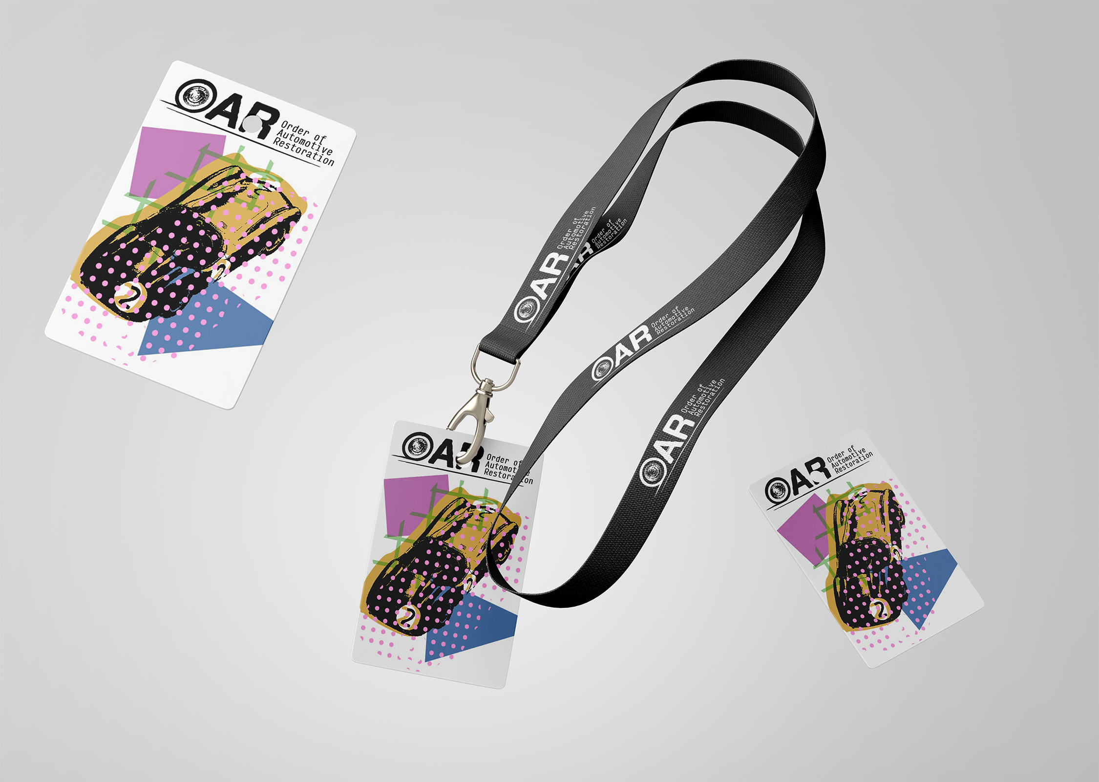
The accompanying lanyard mockup carries forward the event’s graphic identity, again featuring the OAR logo with its chromed white wall tire. This time, the central visual is an old race car with a cicular racing number painted on its hood and tail, a classic reference to mid-century motorsport. The visual effect draws from vintage print techniques, where multiple silhouettes of the same image are layered on top of one another. One layer holds the car’s primary body color, another contains its shadows and darker forms, and others are filled with patterned textures like stripes and dots. I made the choice to offset the layers, exaggerating the printing process’s imperfections. The composition places the car’s form alongside a square and a triangle, emphasizing the pure shapes and physical geometry of classic automotive design. The result is an collectible piece of the conference’s larger visual culture that mirror the creativity and artistry involved in designing and restoring a classic car.
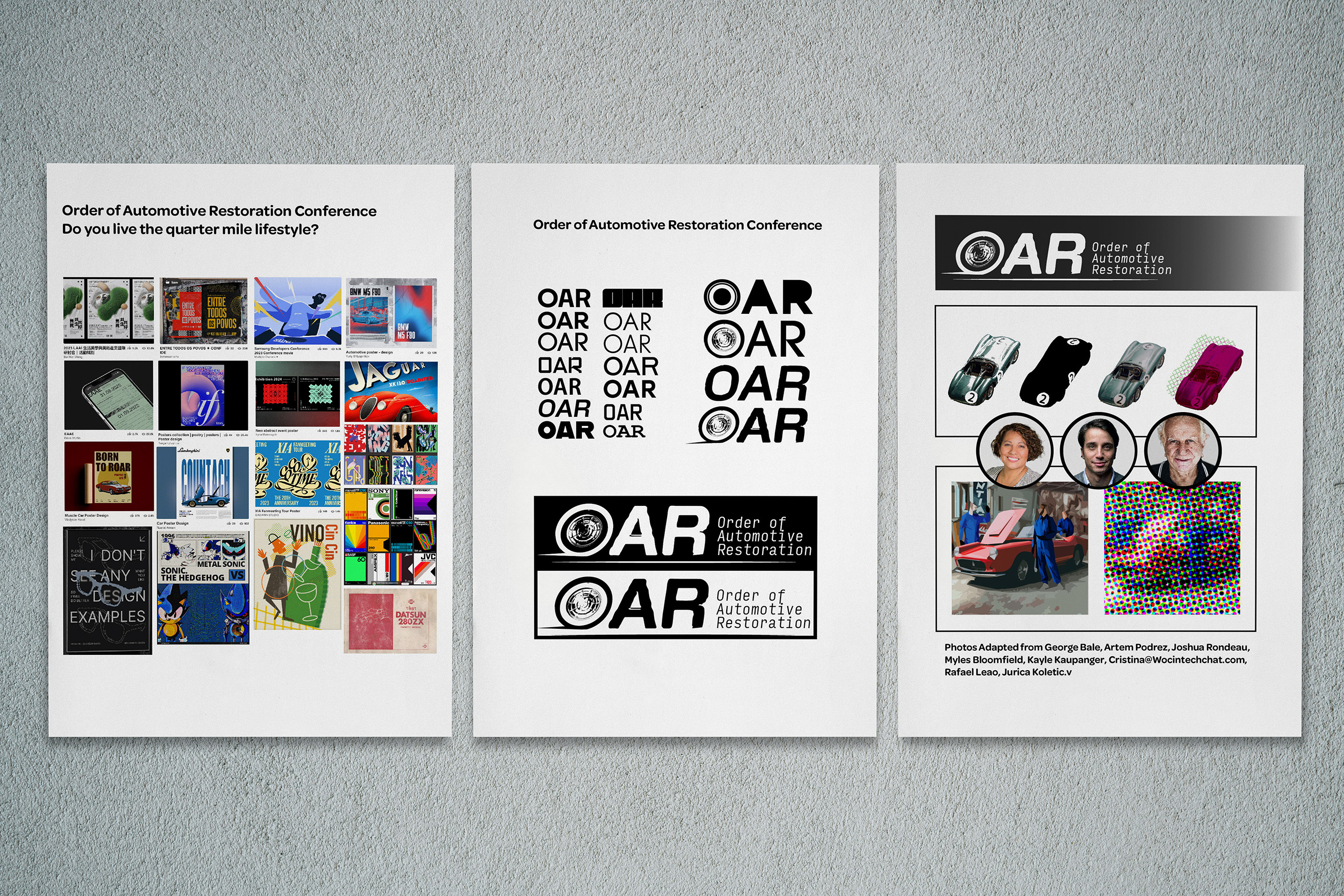
The final image shows the inspiration and decision making process of choosing fonts and applying effects to the images.
Takeaways
This project successfully created a cohesive visual language rooted in automotive heritage, analog print culture, and mid-century graphic design. By combining textural effects, heritage typography, and narrative-driven imagery, it evokes the craftsmanship, community, and optimism of a pre-digital visual world. The process reinforced the value of drawing from material culture and physical processes to create brands that feel both timeless and personal. It also highlighted how historical visual languages can be reframed to remain relevant, offering a contemporary audience both nostalgia and renewed cultural connection.